CalendarComponent Code
A note before we start. In this tutorial we will be using features of two libraries beyond the scope of course.
Pandas - a fast and flexible Python library for data manipulation and analysis
Plotly - a versatile Python library for creating interactive, web-based data visualizations
Plotly is the library that supports Anvil’s plots, while Pandas provides the computing backbone for Plotly. We will only be scraping the surface of both of these libraries, so their functions will not be explained in detail.
If you wish to know more about these libraries, then you can do so through the following tutorials:
Plan
The nature of Plotly means that we will be creating the chart on the backend, and then sending it to frontend to be displayed. Therefore the majority of our code will be written in the assessment_service module.
We will need to create a get_chart method that:
retrieve details from the assessments table
create a dataframe for the assessment details
use Plotly to create a timeline chart from the dataframe
send the chart back to the frontend
Dataframes
DataFrames are digital tables where Pandas stores, organises, and works with data, just like you would with rows and columns in a spreadsheet.
Now we have worked out what we need to do, we can start coding.
Coding
get_chart
To code the get_chart method we need to:
Open the assessment_service server module
add the highlighted code to the import section
1import anvil.users
2import anvil.tables as tables
3import anvil.tables.query as q
4from anvil.tables import app_tables
5import anvil.server
6import plotly.express as px
7import pandas as pd
Code explanation
line 6 → imports the plotly.express library and assigns it the px alias
line 7 → imports the pandas library and assigns it the pd alias
Import aliases
Import aliases in Python allow you to import a module or a function using a shorter or more convenient name, making your code easier to write and read.
move to the bottom of the assessments_service
the highlighted code to retrieve the necessary data
44@anvil.server.callable
45def get_chart():
46    # Fetch assessments from the data table
47    user = anvil.users.get_user()
48    assessments = app_tables.assessments.search(tables.order_by('due_date'),
49                                       user=user,
50                                       completed=False)
Code explanation
line 44 → makes get_chart callable from the frontend
line 45 → creates the get_chart method
line 47 → gets the current user
line 48 → retrieves all the outstanding assessments and stores them in the assessments variable
to process the data, add the code highlighted below
44@anvil.server.callable
45def get_chart():
46    # Fetch assessments from the data table
47    user = anvil.users.get_user()
48    assessments = app_tables.assessments.search(tables.order_by('due_date'),
49                                       user=user,
50                                       completed=False)
51
52    # Create a DataFrame from the assessments data
53    data = []
54    for assessment in assessments:
55        data.append({
56            "Subject": assessment['subject'],
57            "Details": assessment['details'],
58            "Start": assessment['start_date'],
59            "Due": assessment['due_date']
60        })
61
62    df = pd.DataFrame(data)
Code explanation
line 53 → creates the data list to be used for processing the data
line 54 → iterates over all the assessments stored in the assessments variable
line 55 - 60 → creates a dictionary of each assessment and then adds this to the data list
line 62 → converts all the assessment dictionaries in a dataframe
add the highlighted code to create the chart
44@anvil.server.callable
45def get_chart():
46    # Fetch assessments from the data table
47    user = anvil.users.get_user()
48    assessments = app_tables.assessments.search(tables.order_by('due_date'),
49                                       user=user,
50                                       completed=False)
51
52    # Create a DataFrame from the assessments data
53    data = []
54    for assessment in assessments:
55        data.append({
56            "Subject": assessment['subject'],
57            "Details": assessment['details'],
58            "Start": assessment['start_date'],
59            "Due": assessment['due_date']
60        })
61
62    df = pd.DataFrame(data)
63
64    # Create the Gantt chart using Plotly
65    fig = px.timeline(df,
66                      x_start="Start",
67                      x_end="Due",
68                      y="Subject",
69                      text="Details",
70                      title="Assessment Schedule"
71                     )
72
73    return fig
Code explanation
lines 65 - 71 → creates the timeline chart and stores it in the variable fig
df → the dataframe for the chart
x_start=”Start” → identifies the dataframe column which will be used at the starting point for each bar
x_end=”Due” → identifies the dataframe column which will be used at the end point for each bar
y=”Subject” → provide the column that will be the y axis
text=”Details” → labels each bar with the details
line 73 → send the chart to the frontend
CalendarComponent
Now that we have a backend method that provides the chart, we need to call that from the CalendarComponent:
Open calendarComponent in the Code mode.
Add the highlighted code to create the load_chart method
24  def load_chart(self):
25    fig = anvil.server.call('get_chart')
26
27    # Assign the Plotly figure to the Anvil Plot component
28    self.plot_timeline.figure = fig
Code explanation
line 24 → creates the load_chart method
line 25 → gets the chart by calling the get_chart backend function we just created
line 28 → displays the chart on the self.plot_timeline
Finally we need to call the load_chart method so it displays when the component is loaded
Go to the bottom of the
__init__method and had the highlighted line
12  def __init__(self, **properties):
13    # Set Form properties and Data Bindings.
14    self.init_components(**properties)
15
16    # Any code you write here will run before the form opens.
17    if anvil.users.get_user():
18      self.card_details.visible = True
19      self.card_error.visible = False
20      self.load_chart()
21    else:
22      self.card_details.visible = False
23      self.card_error.visible = True
Code explanation
line 20 → runs the load_chart method when the Calendar Component is loaded.
Testing
Time to test all that code. Launch your web app and navigate to the Calendar page. You should see something similar to below.
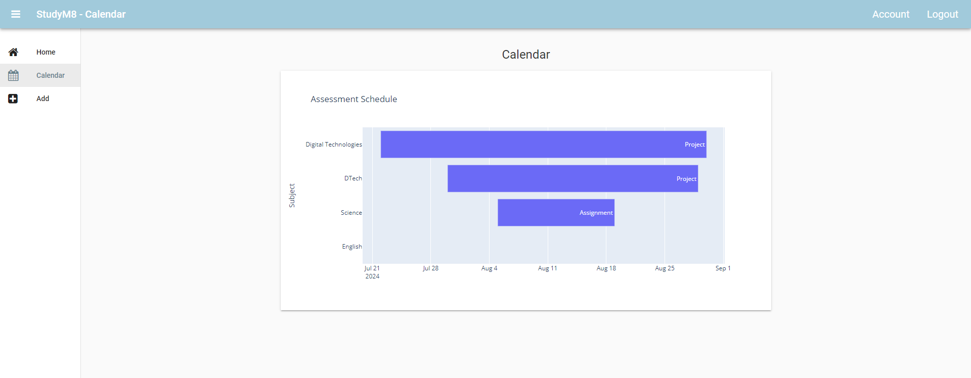
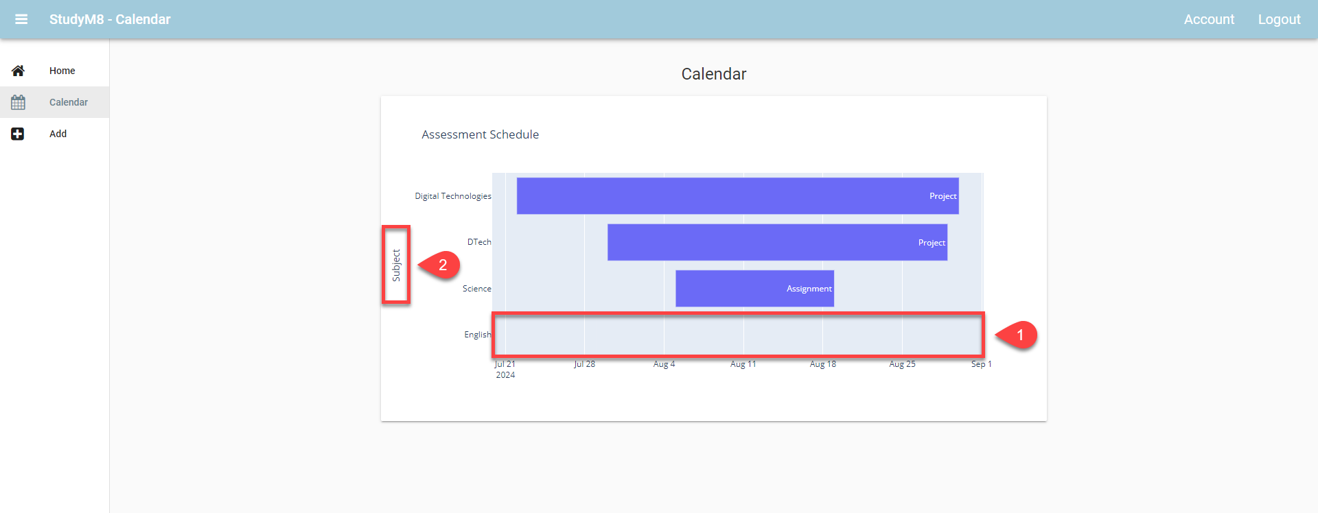
If you look closely, there are a couple of problems with our chart.
There is no bar for the English exam
The y-axis title (subject) is unnecessary
So lets fix those two.
Exams not appearing
The reason that exams do not appear on the chart, is that the start date and the due date are the same. The timeline chart plots the time between the start and finish, and in the case of exams, this is nothing.
The easiest way to solve this problem is to move the due date back one day. But be careful, we only want to do this for exams, ie. where the due date is the same as the start date.
Lets implement this:
Open the assessment_service server module
Add the highlighted code inside the dataframe creation code
52    # Create a DataFrame from the assessments data
53    data = []
54    for assessment in assessments:
55        # adjust for exams
56        start_date = assessment['start_date']
57        due_date = assessment['due_date']
58
59        if start_date == due_date:
60            due_date += pd.Timedelta(days=1)
61
62        data.append({
63            "Subject": assessment['subject'],
64            "Details": assessment['details'],
65            "Start": assessment['start_date'],
66            "Due": assessment['due_date']
67        })
68
69    df = pd.DataFrame(data)
Code explanation
line 56 → stores the start date in the start_date variable
line 57 → stores the due date in the due_date variable
line 59 → checks to see if the start date and due date are the same
line 60 → uses Pandas’ Timedelta method to add one day to the due_date
Now we have adjusted the start and due dates, we need to put these values into the diction before it is added to the data list.
Adjust the highlighted line of code
52    # Create a DataFrame from the assessments data
53    data = []
54    for assessment in assessments:
55        # adjust for exams
56        start_date = assessment['start_date']
57        due_date = assessment['due_date']
58
59        if start_date == due_date:
60            due_date += pd.Timedelta(days=1)
61
62        data.append({
63            "Subject": assessment['subject'],
64            "Details": assessment['details'],
65            "Start": assessment['start_date'],
66            "Due": due_date
67        })
68
69    df = pd.DataFrame(data)
Code explanation
line 66 → add our adjusted due_date to the dataframe
Testing Exams
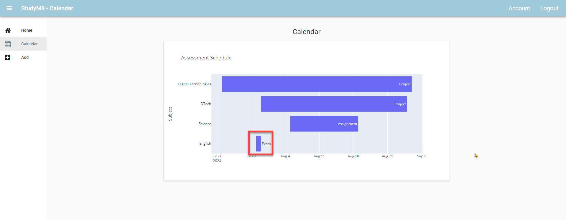
Launch your web app and navigate to the calendar page (note: make sure you have added an exam assessment). You should now see your exams.
y-axis title
Plotly provides a wide range of formatting options. These options can be found in the Anvil documentation or the Plotly documentation.
We will only be concerned with removing the y-axis title.
Open the assessment_service
At the bottom of the creating Gantt chart section add the highlighted code.
71    # Create the Gantt chart using Plotly
72    fig = px.timeline(df,
73                      x_start="Start",
74                      x_end="Due",
75                      y="Subject",
76                      text="Details",
77                      title="Assessment Schedule"
78                     )
79
80    fig.update_yaxes(title_text="")
81
82    return fig
Code explanation
line 80 → makes the y-axis blank
Test the y-axis
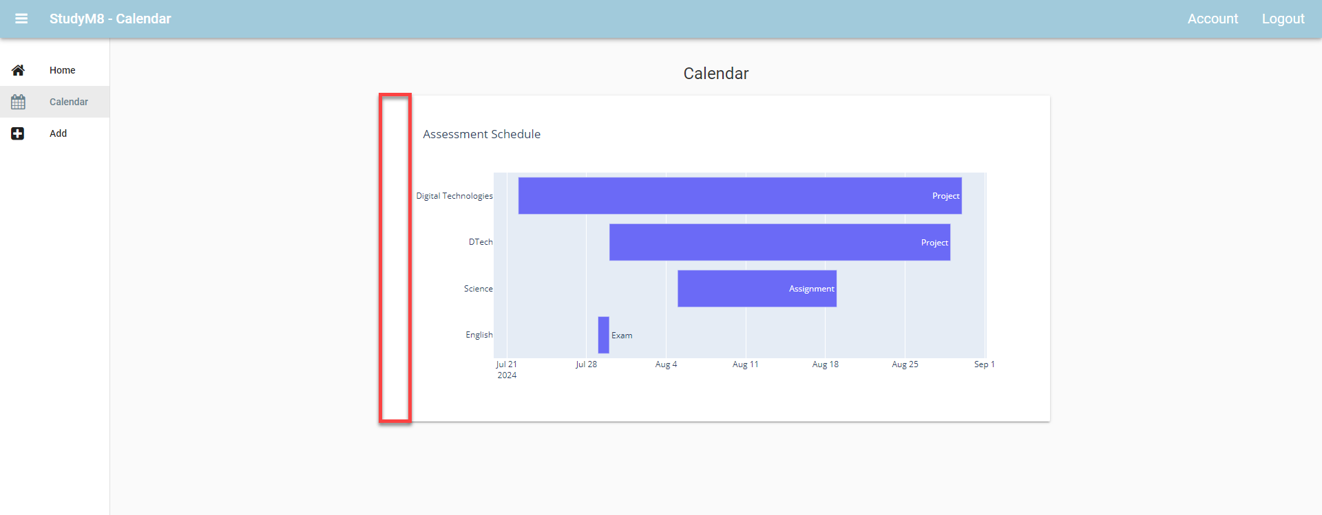
Once again launch you web app and check that the y-axis title has gone.
Final code state
By the end of this tutorial your code should be the same as below:
Final CalendarComponent
 1from ._anvil_designer import CalendarComponentTemplate
 2from anvil import *
 3import plotly.graph_objects as go
 4import anvil.server
 5import anvil.tables as tables
 6import anvil.tables.query as q
 7from anvil.tables import app_tables
 8import anvil.users
 9
10
11class CalendarComponent(CalendarComponentTemplate):
12  def __init__(self, **properties):
13    # Set Form properties and Data Bindings.
14    self.init_components(**properties)
15
16    # Any code you write here will run before the form opens.
17    if anvil.users.get_user():
18      self.card_details.visible = True
19      self.card_error.visible = False
20      self.load_chart()
21    else:
22      self.card_details.visible = False
23      self.card_error.visible = True
24
25  def load_chart(self):
26    fig = anvil.server.call('get_chart')
27
28    # Assign the Plotly figure to the Anvil Plot component
29    self.plot_timeline.figure = fig
Final assessment_service
 1import anvil.users
 2import anvil.tables as tables
 3import anvil.tables.query as q
 4from anvil.tables import app_tables
 5import anvil.server
 6import plotly.express as px
 7import pandas as pd
 8
 9@anvil.server.callable
10def add_assessment(subject, details, start_date, due_date):
11  user = anvil.users.get_user()
12
13  app_tables.assessments.add_row(user= user,
14                                 subject= subject,
15                                 details=details,
16                                 start_date=start_date,
17                                 due_date=due_date,
18                                 completed=False)
19
20@anvil.server.callable
21def get_assessment():
22  user = anvil.users.get_user()
23
24  return app_tables.assessments.search(tables.order_by('due_date'),
25                                      user=user,
26                                      completed=False)
27
28@anvil.server.callable
29def update_assessment_completed(assessment_id, completed):
30  assessment = app_tables.assessments.get_by_id(assessment_id)
31  if assessment:
32    assessment["completed"] = completed
33
34@anvil.server.callable
35def update_assessment(assessment_id, subject, details, start_date, due_date, completed):
36    assessment = app_tables.assessments.get_by_id(assessment_id)
37    if assessment:
38        assessment['subject'] = subject
39        assessment['details'] = details
40        assessment['start_date'] = start_date
41        assessment['due_date'] = due_date
42        assessment['completed'] = completed
43
44@anvil.server.callable
45def get_chart():
46    # Fetch assessments from the data table
47    user = anvil.users.get_user()
48    assessments = app_tables.assessments.search(tables.order_by('due_date'),
49                                       user=user,
50                                       completed=False)
51
52    # Create a DataFrame from the assessments data
53    data = []
54    for assessment in assessments:
55        # adjust for exams
56        start_date = assessment['start_date']
57        due_date = assessment['due_date']
58
59        if start_date == due_date:
60            due_date += pd.Timedelta(days=1)
61
62        data.append({
63            "Subject": assessment['subject'],
64            "Details": assessment['details'],
65            "Start": assessment['start_date'],
66            "Due": due_date
67        })
68
69    df = pd.DataFrame(data)
70
71    # Create the Gantt chart using Plotly
72    fig = px.timeline(df,
73                      x_start="Start",
74                      x_end="Due",
75                      y="Subject",
76                      text="Details",
77                      title="Assessment Schedule"
78                     )
79
80    fig.update_yaxes(title_text="")
81
82    return fig