AccountComponent Layout
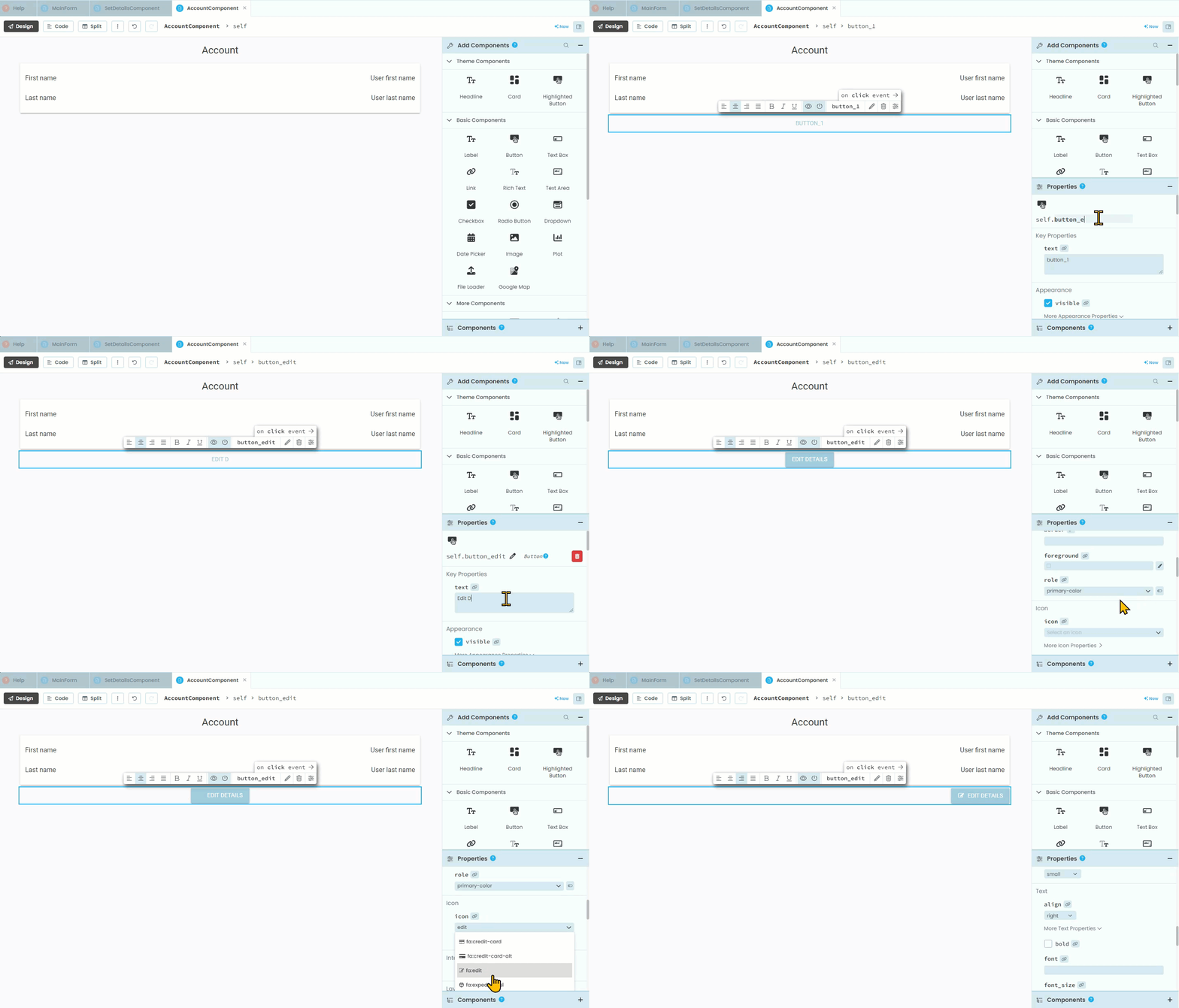
Last tutorial we noted that we need to populate the AccountComponent. We will do this over two tutorials. This one will focus on creating the layout, while the next tutorial will address the code.
Design
If we check back at our wireframes we will see that the AccountComponent displays the first name and last name as well as an edit button. The layout is very similar to the SetDetailComponent, so this should seem very familiar.
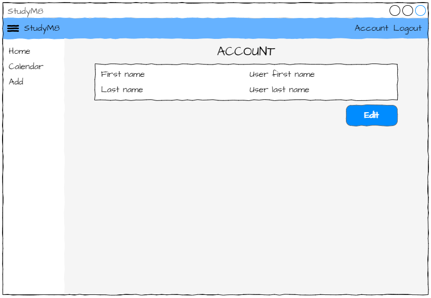
Unlike the SetDetailsComponent there are no text boxes, with labels being used to display the first name and last name values for the current user. We will still need to use a Column Panel and the Button will be used to load the SetDetailsComponent so users can change their details.
The layout
Open the AccountComponent in Design mode. Most of this is revisiting the layout for the SetDesignComponent so I will not be going into as much detail.
Organisational elements
First we must add a Card element to the layout.
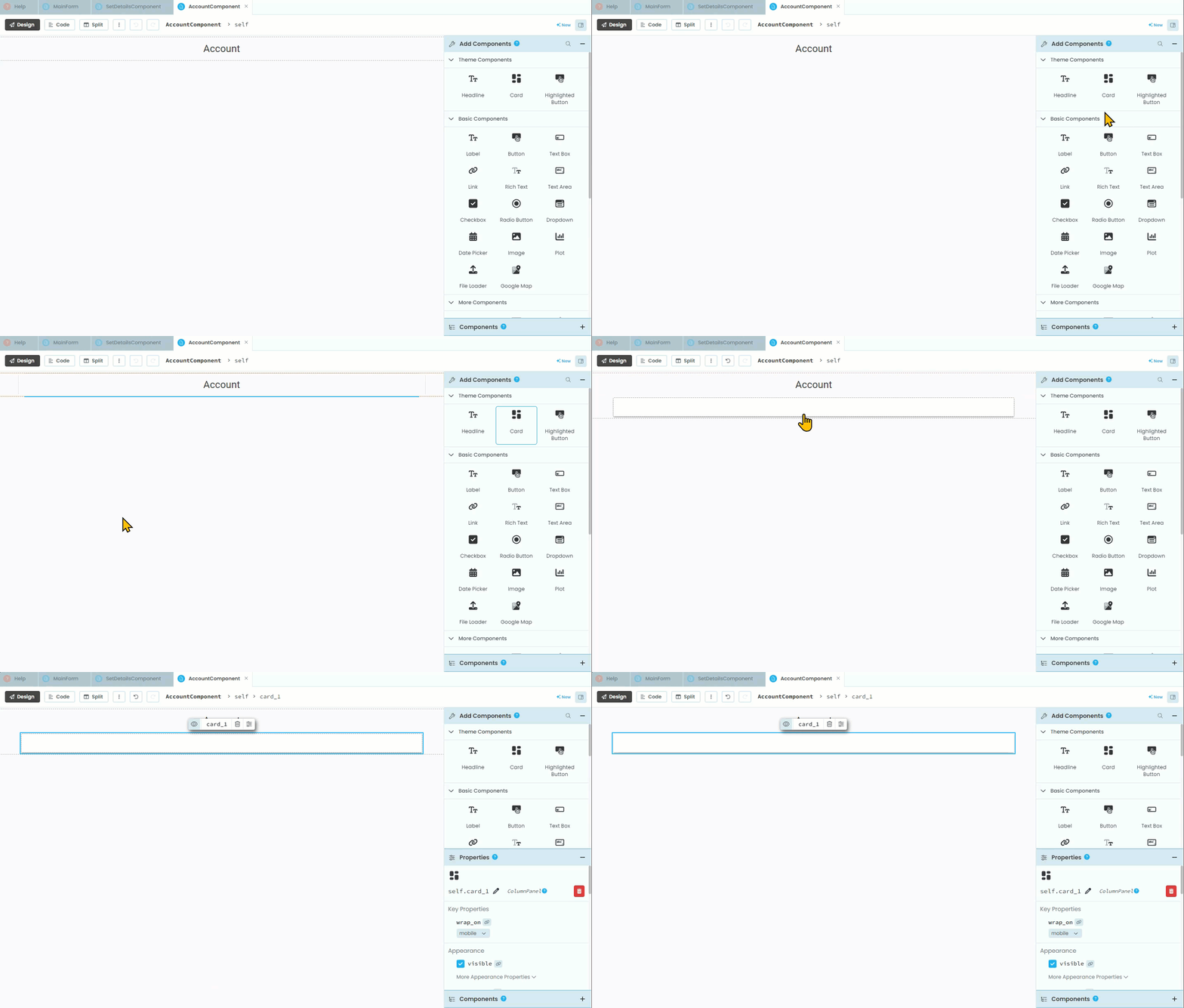
Then we need to add a Column Panel inside the Card
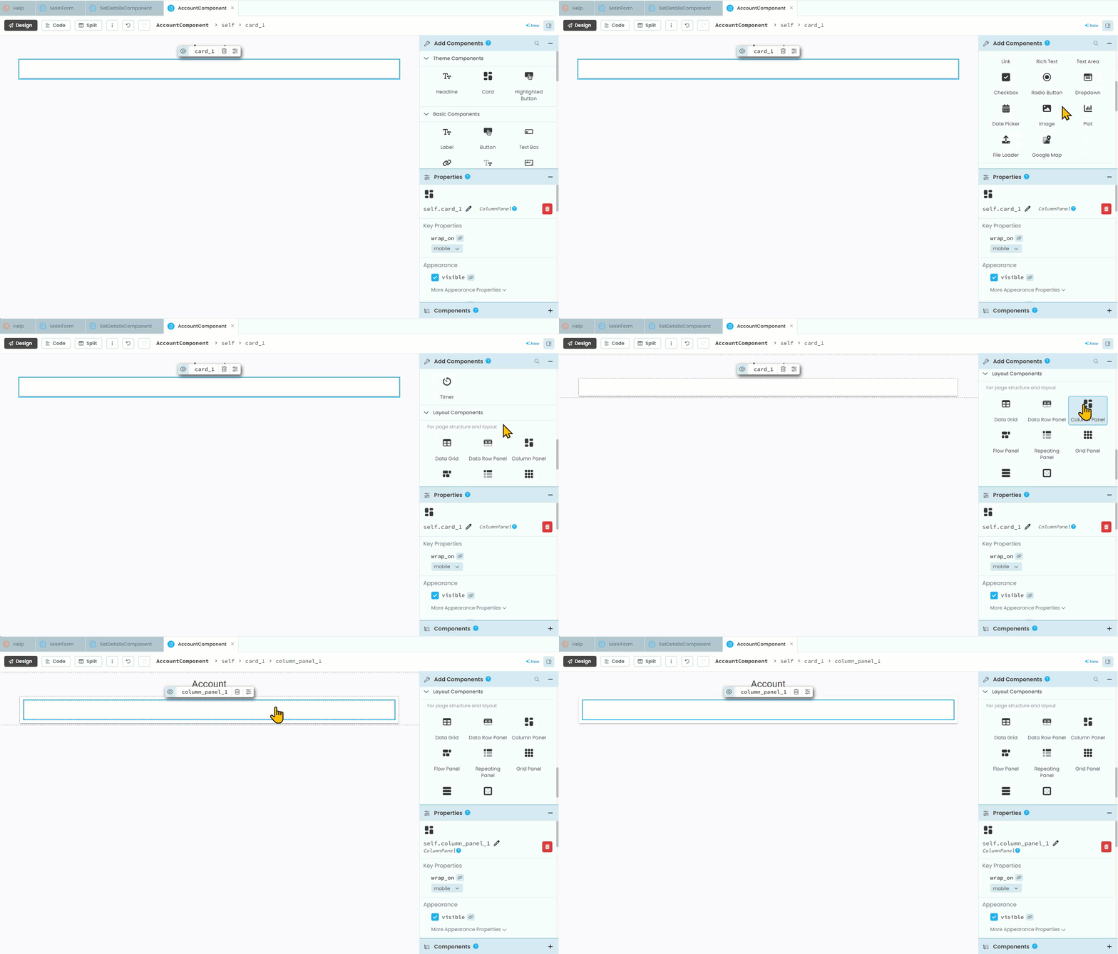
First name elements
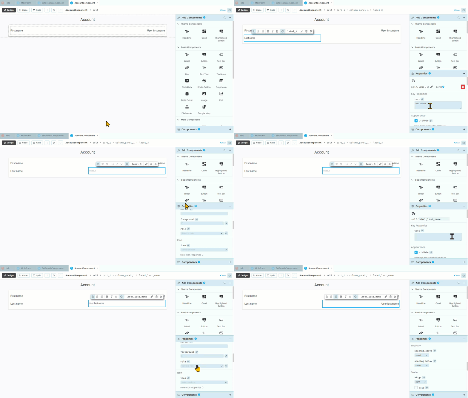
Now we need to add the first name label.
This is the one that says First Name which the code will not interact with, so no need to change its name.
We will still set the role to input-prompt so we can keep the text formatting consistent between the AccountComponent and the SetDetailsComponent.
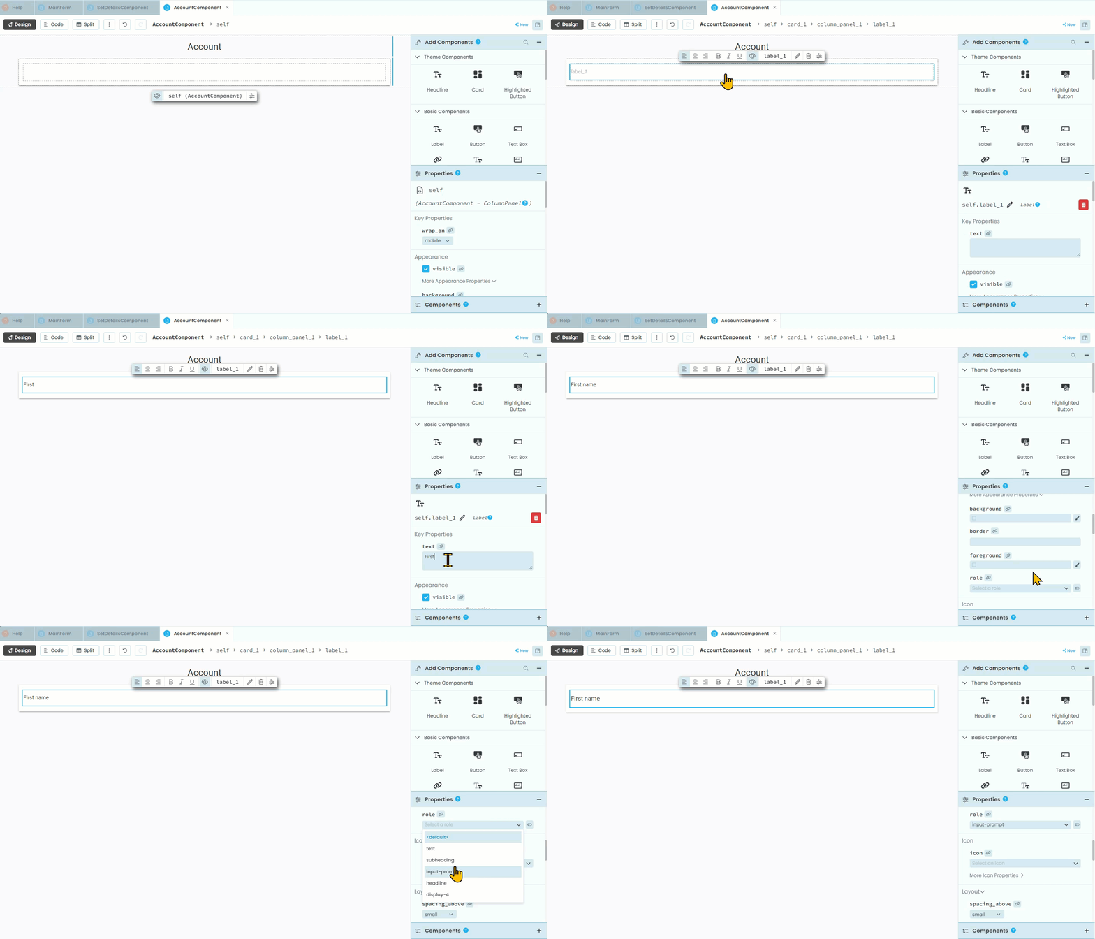
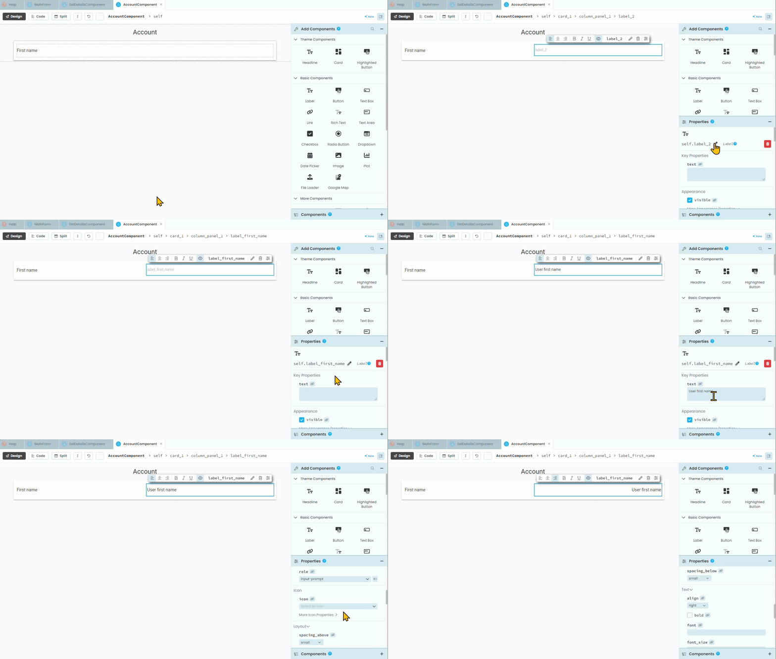
To the right of that label e need to add another label that will display the user’s data.
We will need to name this label calling it
label_first_nameWe’ll also set the default text to
"User first name"The role will be input-prompt
Finally alignment should be right
Last name elements
Under the first name elements we need to add the exact same elements, only for the last name.
