SetDetailsComponent Design
If you look at the user table, you will notice that our registered users are missing their first and last names. In this tutorial we will fix this issue.
Planning
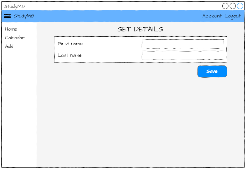
If you refer back to our design you will notice that we have a SetDetailsComponent which has a space for the user names.
At the moment, when a new user is registered, the link_register_click method redirects them to the HomeComponent. We need to change that so it redirects to the SetDetailsComponent.
We then need to create an event handler for the Save button that reads the values and writes them to the user table. Our user table is expecting text values, what if they accidently leave one of the names blank? We need to validate the data to make sure that both text boxes have values, and only then write those values to the user table.
Data validation
Data validation of user input is crucial for several reasons:
Security: Validating data helps prevent security vulnerabilities such as SQL injection and cross-site scripting (XSS), protecting the application and its users from malicious attacks.
Data Integrity: Ensures that the data entered is accurate, consistent, and usable, maintaining the quality of the information stored.
User Experience: Provides immediate feedback to users when they enter incorrect or incomplete data, improving the overall user experience and reducing errors.
Functionality: Ensures that the application functions correctly by preventing invalid data from causing issues or crashes.
Compliance: Helps meet legal and regulatory requirements for data handling and privacy by ensuring that only valid data is processed and stored.
Finally, when that is all done, we need to load the AccountComponent, so they can see the names they just entered.
This is quite a bit, so we’ll split it over the next three tutorials.
Deals with the layout of the SetDetailsComponent
Coding the SetDetailsComponent
Addresses writing the information to the user table
Designing
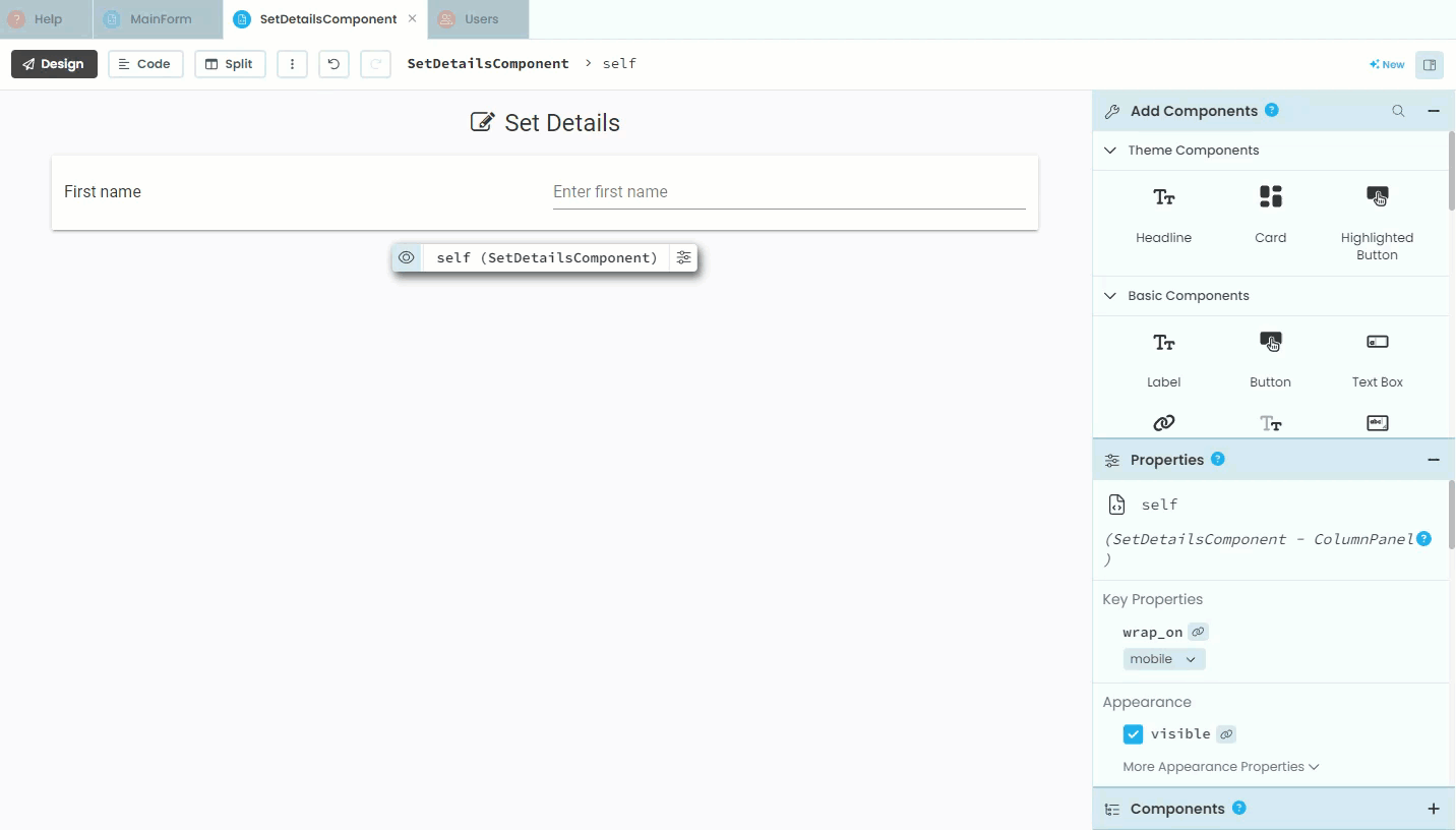
Before we can jump into our code we need to add all the appropriate elements to the layout of the SetDetailsComponent.
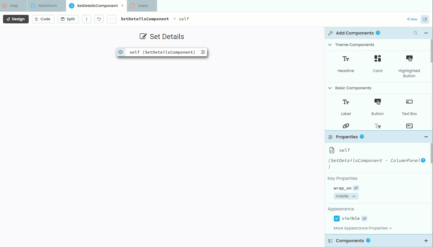
Open the SetDetailsComponent in design mode.
Title
Currently, the only element on the component is the title. We’ll start with adding an icon to the title.
Click on the title
Find Icon in the Properties panel
Choose the
fa:editicon

Add Card
Cards are an essential design element in Material Design. They are a container used to group related information, which make content easy to scan and interact with. If you have used websites in the last decade, you have seen cards, you just might not have known what they are.
We are going to add a card under the title:
Find Card in the Add Components panel
Click on Card
Move to under the title (look for the blue line)
Click
Since our code is not going to interact with this card, we don’t need to change it’s name.
Add Column Panel
In order to organise our labels and textboxes, we need to use a layout element called a Column Panel.
In the Add Components panel, find and click Column Panel
Click inside the Card in layout (make sure you have the blue line inside the card)

Add First name elements
Now we can start adding the First name elements. We’ll start with the label.
In the Add Component panel, find and click Label
Click inside the Card in layout (make sure you have the blue line inside the card)
In Text in the Properties panel write
First nameFind role in the Appearance section of the Properties panel and choose input-prompt
Again our code will not interact with this label, so we don’t have to change the name.

Now the First name text box. Note, our code will interact with this element, so we should change the name to something that makes sense.
Click on Text Box in the Add Component panel
Click inside the Card. To ensure you’re inside the Column Panel you need to pay very close attention to where the blue line is before you click. The line should be right beside a brown box surrounding the First name label.
Change the name of the text box to
text_box_first_nameFind the placeholder property and add
Enter first name
Placeholders
Textbox placeholders are text displayed inside input fields on forms to give users a hint about what information is expected. They appear when the input field is empty and disappear once the user starts typing.
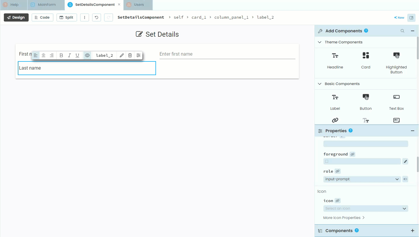
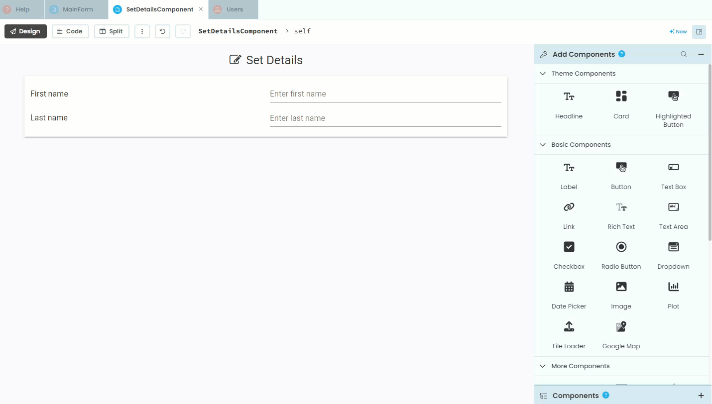
Add Last name elements
Now to add the Last name label.
Click Label in the Add Component panel
Click inside the Card, making sure that your blue line is directly under the the First name label
In Text in the Properties panel write
Last nameFind role in the Appearance section of the Properties panel and choose input-prompt
Just like the First name label our code will not interact with this label, so we don’t have to change the name.
Then the Last name text box, which is virtually the same the the First name text box.
Click on Text Box in the Add Component panel
Click inside the Card. Make sure the blue line is directly under the First name text box.
Change the name of the text box to
text_box_last_nameFind the placeholder property and add
Enter last name
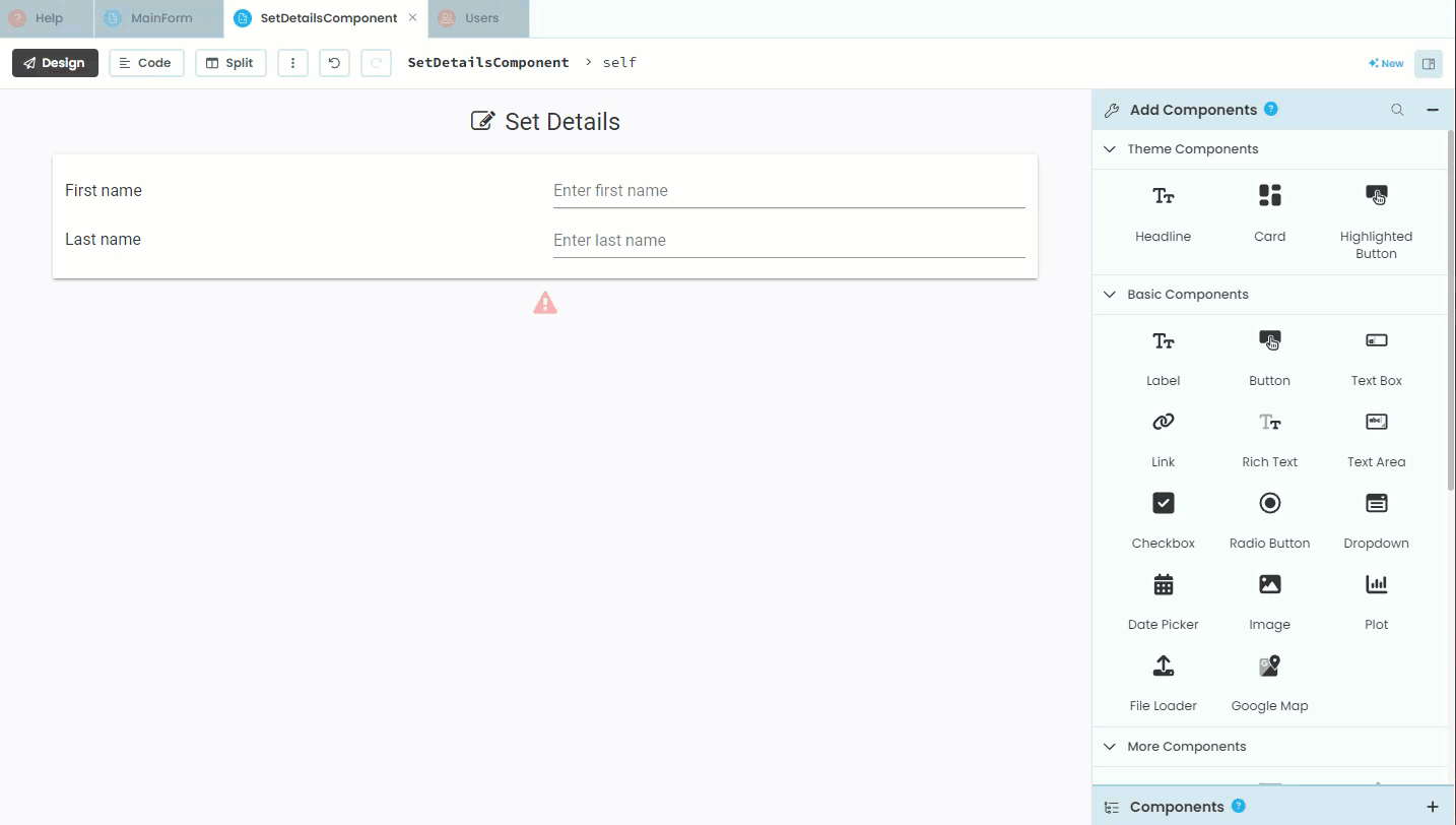
Error Message
Since we are going to validate the user’s input, we need a way to explain any problems that might arrise. To do this we will add an error message label under the card. Our code will interact with this label, so we should name it appropriately.
Click Label in the Add Component panel
Click under the Card making sure the blue line is outside the card.
Change the name of the label to
label_errorWe are not adding text, since our code will dynamically set the text
Uncheck the visible property
Set foreground (text) colour to
#ff0000(red)Set role to
headlineSelect
fa:warningfor the icon propertyFinally set align to
center
Save Button
To finish off the SetDetailsComponent layout we need to add a button.
Select Button from the Add Component panel
Place the button under the Error label
Change the name the button to
button_saveChange the text to
Save DetailsChoose the role that suits your design
Set the icon to
fa:saveSet align to
right
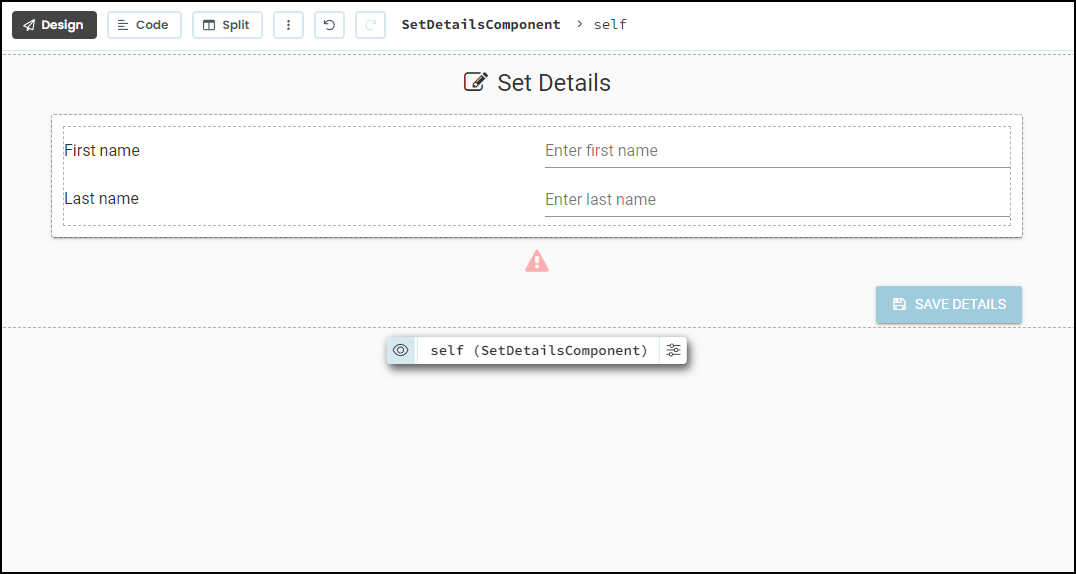
That completes the layout of the SetDetailsComponent. Your layout should look like the one below.